How to design UI with Codex.
Codex can design app screens and web pages as well as code them. The trick is to treat it like a designer you brief, not a button you press: give it context, ask for options, and give feedback it can act on.
Updated November 1, 2026 · 8 min read
What Codex can do for UI design
Codex is OpenAI’s coding agent. It reads and writes files and runs commands in your project, so for UI work it can:
- Write screens as HTML and CSS. A self-contained HTML file is the fastest way to get a realistic, clickable mockup you can open in any browser.
- Work from images. Attach a screenshot, a sketch, or a reference you like, and ask Codex to match its layout or mood.
- Revise on request. “Make the cards softer” or “tighten the spacing” is enough when Codex can see the file it wrote.
- Move the result into your codebase. Once a direction is chosen, the same agent can rebuild it with your framework and components.
What Codex does not give you on its own is a place to see several designs at once. Each HTML file opens in its own tab, which makes comparing directions slow. That gap is why we built Codex Design, a canvas plugin for Codex. You can follow this guide with or without it.
Step 1: Write a design brief
Vague requests get generic results. A good brief answers five questions: what the product is, who uses it, which screens you need, what it should feel like, and the constraints, such as screen size, brand colors, or fonts.
Design the home screen of a coffee subscription app called Ember & Bean. Users are people who already brew at home and want a new single-origin bag every two weeks. The home screen shows the next delivery, two roasts picked for them, and a short brewing tip.

Make it a 390×844 mobile screen as one self-contained HTML file with inline CSS. Use system fonts. No external images: draw the coffee bags with CSS.
Asking for one self-contained file matters. It keeps every screen portable, quick to revise, and easy to preview.
Step 2: Ask for several directions, not one
The first design is rarely the best one. Ask for three directions that differ on purpose, so you are choosing between real alternatives instead of variations of the same idea.
Create three directions for this screen, each in its own file:
A — warm and editorial, with a serif headline
B — bold and dark, with one bright accent color
C — soft and calm, with rounded cards and lots of air
Keep the content identical so we compare only the visual style.
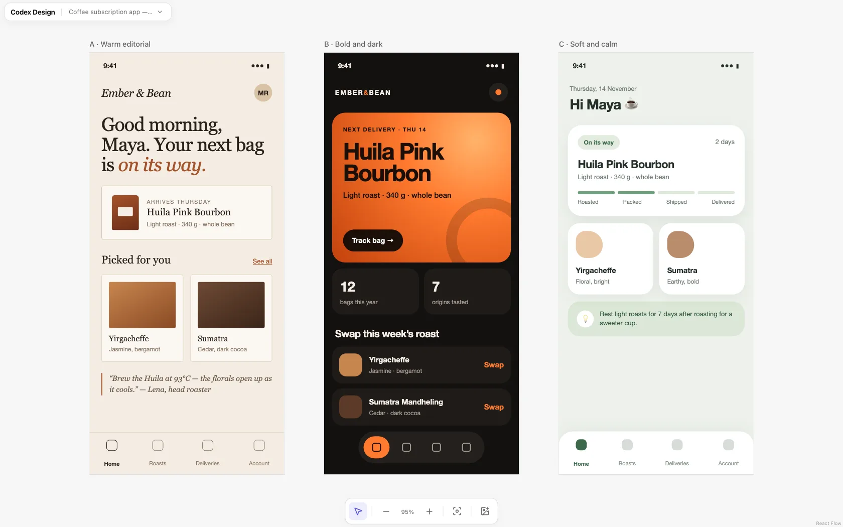
Step 3: Review the designs side by side
Put the directions next to each other before you judge them. Differences in hierarchy, density, and tone are much easier to see at a glance than one tab at a time.
- Without a plugin: open each HTML file in your browser, or ask Codex to build one comparison page that embeds all three screens in a row.
- With Codex Design: ask Codex to put the screens on a canvas. They appear next to each other as live HTML, and you can add reference images beside them. Install Codex Design with one prompt to try it.
Pick one direction, or name the parts you like from each: “B’s delivery card with C’s calmer colors” is a perfectly good next brief.
Step 4: Refine with specific feedback
Codex responds best to feedback that names an element and a change. Compare these two requests:
- Weak: “Make it look better.”
- Strong: “Increase the greeting to 32px, reduce the card padding to 16px, and make the delivery progress bar the first thing you notice.”
Refine direction C:
- Make the greeting larger and the date smaller.
- Show the delivery progress before the roast recommendations.
- Use one accent green for active states only.
- Keep everything else the same.
“Keep everything else the same” is worth adding to almost every revision. It stops the agent from redesigning parts you were already happy with.
Step 5: Fine-tune details by hand
Some changes are faster to make than to describe: nudging a font size, trying three shades of a color, or adjusting padding by a few pixels. Edit the HTML directly, or, with Codex Design, select an element on the canvas and change its font, color, and spacing in the properties panel. Codex sees the updated file the next time you ask it for a change.
Step 6: Turn the design into production code
A mockup is a spec, not the final code. When a direction is approved, ask Codex to rebuild it inside your app:
Implement the approved home screen in our React Native app.
Use our existing Button and Card components and the colors in theme.ts.
Match the mockup in asset/coffee-home-soft.html for layout and spacing.
Tips for better results
- Give real sizes. 390×844 for a phone, 1440×900 for a desktop page. Without them, layouts drift.
- Use real content. Plausible names, prices, and dates reveal layout problems that “Lorem ipsum” hides.
- Show, don’t only tell. A reference screenshot communicates a style faster than a paragraph of adjectives.
- Name your tokens. If you have brand colors, fonts, or a spacing scale, put them in the brief so every direction uses them.
- Keep one screen per file. It makes each revision small and easy to review.
Frequently asked questions
Can Codex really design UI, or only write code?
Both. Codex writes the HTML and CSS that a screen is made of, so it can produce complete visual designs. The quality depends on the brief and on how specific your feedback is.
Do I still need Figma?
Not for exploring and testing directions. Many teams still keep Figma for shared design systems and handoff. HTML mockups have one advantage: they are already code.
Do I need a plugin to design with Codex?
No. Everything in this guide works with plain HTML files. A canvas plugin such as Codex Design makes comparing and refining several screens faster.