GPT-6.1 Terra vs Sol for UI design.
Codex now uses GPT-6.1 Sol by default, and GPT-6.1 Terra, the faster and cheaper model released on October 26, 2026, is one flag away. We gave both the same three UI prompts, a landing page, a SaaS dashboard, and a mobile app screen, with no design direction. Terra was faster and used fewer tokens. The bigger finding: both models reach for the same look.
Updated November 7, 2026 · 6 min read
The short answer
- For UI work, Terra is the better default. On our landing page prompt it finished in 1 minute 31 seconds with 9,803 tokens; Sol took 2 minutes 16 seconds and 21,583 tokens. The screens were of similar quality.
- Sol adds more on its own. Unprompted, it added a skip link, a pricing preview dialog, and a note that the prices were illustrative. Use it when the screen has real logic to get right.
- Neither has taste of its own. With no direction, five of six screens came out sage or green, all six used DM Sans, and the checker found emoji icons in all six. The model you pick matters less than the direction you give it.
How we tested
We used the Codex CLI (version 0.166) signed in with a ChatGPT account, at the default medium reasoning effort, and ran each prompt once per model in an empty folder. Each prompt asked for a single index.html with Tailwind from the CDN and gave no colors, fonts, or style. Then we took screenshots and ran the pretty-ui checker on every file.
The three prompts:
- A landing page for Tally, an invoicing app for freelancers, with a hero, three features, two pricing plans, and a footer.
- The main dashboard of a subscription analytics app: MRR, churn, customers, a revenue chart, and recent events.
- The home screen of a habit tracker app at 390×844: today’s habits, a streak, and a bottom tab bar.
One run per prompt is a small test, not a benchmark. Run the same prompt twice and you will get a different page. But the patterns below showed up in every run.
The results
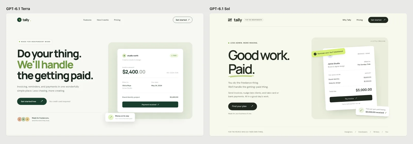
The landing page prompt. Terra on the left, Sol on the right.
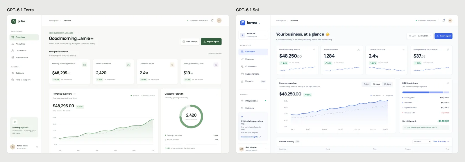
The dashboard prompt. Both put MRR near $48,000 and churn at 2.4%.
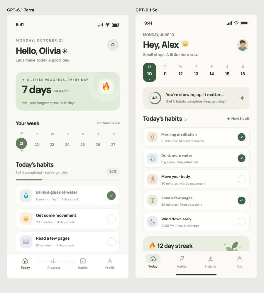
The mobile prompt. Both chose a greeting, a week strip, a streak card, and green check circles.
| Prompt | Model | Tokens | Fonts | Main color | Checker findings |
|---|---|---|---|---|---|
| Landing page | Terra | 9,803 | DM Sans, Manrope | Dark green on sage | 5 errors: emoji icons, a placeholder name |
| Landing page | Sol | 21,583 | DM Sans, Manrope | Dark green on sage | 4 errors: emoji icons; a backdrop-blur warning |
| Dashboard | Terra | 12,532 | DM Sans, Manrope | Green | Emoji icons, placeholder names |
| Dashboard | Sol | 14,520 | DM Sans | Blue and green | Emoji icons, placeholder names |
| Mobile app | Terra | 10,981 | DM Sans, Manrope | Sage | 7 emoji icons |
| Mobile app | Sol | 12,073 | DM Sans, Manrope | Sage | 6 emoji icons |
Terra used fewer tokens on all three prompts. Both models produced polished, coherent screens: real hierarchy, consistent spacing, and sensible empty space. Sol’s pages were a little richer, with more states and small interactions.
The new default look
Two years ago an unstyled prompt got a purple gradient and Inter. In our six runs it got this instead:
- A pale sage or off-white background with a dark green accent, and a lime highlight for one word or badge.
- DM Sans for everything, often with Manrope next to it.
- A small all-caps label in a pill above the headline, like “MADE FOR INDEPENDENT WORK”.
- A floating card that overlaps the hero image, such as an invoice with a “Paid” badge.
- Emoji as icons: a flame for a streak, a water drop for a habit.
- Placeholder people and companies. Terra billed “Olivia Rhye” at “Acme Studio”; Olivia Rhye is the sample user in a popular UI kit.
None of these are wrong on their own, and the screens look good. The problem is that everyone asking for a page without direction gets this same page, so it will start to read as AI-made. We keep a list of these patterns in AI UI design tells.
Which one to use for UI design
- Exploring, mocking up, and iterating on screens: Terra. It is faster and cheaper, so you can try more directions in the same time.
- Building screens with real behavior, like forms, data tables, and flows across several files: Sol. It adds the states and edge cases you would otherwise ask for.
- Either way, decide the design yourself. Both models follow a design system closely when they have one.
To switch models in the Codex CLI, start it with codex -m gpt-6.1-terra, or use /model inside a session.
Get a design that isn’t the default
The fix is the same for both models: give a direction before the first screen.
- Pick a design system with named colors, fonts, radius, and spacing. Take one from our design system library, or write a DESIGN.md.
- Ask for three directions, not one, and choose. Our open-source pretty-ui skill does this for you and saves the choice as a DESIGN.md.
- Say what to avoid, and check the result.
Before building, read DESIGN.md and use only its colors, fonts, radius and spacing. Don't use emoji as icons; use [Lucide] icons. Don't use sample names like Acme or John Doe; use realistic content for [your product]. No small all-caps labels above headings. Then build [the screen].
Frequently asked questions
Is GPT-6.1 Terra available in Codex with a ChatGPT plan?
Yes. We ran it with a ChatGPT account in the Codex CLI. OpenAI rolled it out to ChatGPT Work and Codex on October 26, 2026.
Is GPT-6.1 Sol better at design than Terra?
Not in our test. The screens were of similar quality and looked alike. Sol spent more tokens adding behavior, such as dialogs and accessibility details, rather than a better look.
Why do both models pick sage green and DM Sans?
With no direction, a model produces the most typical page it has learned. Each wave of advice against the last default creates a new one, and right now that is a calm green palette with a rounded sans-serif. A design system replaces the default with your choices.