Landing page design prompts.
Eight prompts that take a landing page from a blank brief to production code. Paste them into Codex in order, replace the details in brackets with your own, and keep each answer as a self-contained HTML file so it is easy to compare and revise.
Updated November 2, 2026
Start with a brief
Every prompt below works better when Codex knows the product, the audience, and the one action you want visitors to take. Write the brief once and keep it at the top of the conversation.
We're designing a landing page for [Tally, an invoicing app for freelancers]. Visitors are [designers, writers, and developers who send 2–10 invoices a month]. The one action we want: [start a free trial]. The main promise: [get paid faster without chasing clients]. Proof we can show: [12,400 users, payments arrive 9 days sooner on average].

Before designing anything, list the sections this page needs, in order, with one sentence on what each section must convince the visitor of.
Explore three hero directions
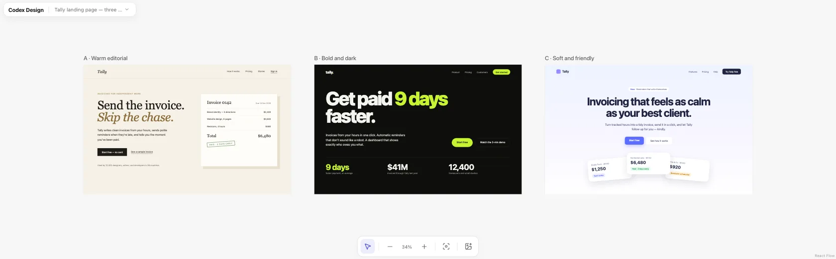
The hero decides whether anyone scrolls. Ask for three directions that differ on purpose, with identical content, so you are comparing style rather than copy.
Design the hero section in three directions, each as its own self-contained HTML file at 1440×900 with inline CSS and system fonts:
A — warm and editorial, with a serif headline
B — bold and dark, with one bright accent color and big numbers
C — soft and friendly, with rounded cards and a light gradient
Use the same headline, subheading, and call to action in all three. Draw any product visuals with HTML and CSS; no external images.
Build the full page
Once a direction is chosen, extend it into the whole page. Naming the sections stops the agent from inventing filler.
Extend direction [B] into a full landing page in one HTML file, 1440px wide. Sections, in order: hero, logo strip, three key features with a small product visual each, how it works in three steps, two customer quotes with names and roles, pricing, FAQ with five questions, and a closing call to action. Keep the hero exactly as it is.
Write a features section with real content
Generic feature cards (“Fast. Secure. Simple.”) are the clearest sign of an AI-made page. Ask for specifics.
Rewrite the features section. Each feature needs a concrete headline that says what the user gets, one sentence with a specific detail or number, and a small UI visual drawn in HTML that shows the feature in use. No icons in colored circles, no one-word headlines.
Design the pricing section
Design the pricing section with [Free, Pro at $12/month, Studio at $29/month]. Highlight [Pro] as the recommended plan. List at most five features per plan, starting with what differs between plans. Add a monthly/annual toggle that shows the annual saving, and one line under the cards answering the most common objection: [Can I cancel anytime?].
Check it on a phone
Many visitors will arrive on a phone, so check the mobile layout before you polish the desktop one.
Make a 390px-wide version of this page as a separate file. Stack sections in a sensible order, keep the call to action visible without scrolling on the first screen, make every tap target at least 44px tall, and tell me which desktop elements you dropped or simplified and why.
Make it look less templated
Review this page for things that make it look AI-generated or templated: centered everything, gradient blobs, identical card grids, vague copy, too many accent colors. List what you find, then fix the five most noticeable issues and keep everything else the same.
Turn it into production code
When the design is approved, rebuild it in your real stack. The HTML file becomes the spec.
Rebuild landing.html as a [Next.js] page using [Tailwind CSS] and our existing components in [src/components]. Match the layout, spacing, and type sizes of the HTML file, make it responsive between 390px and 1440px, and keep the copy exactly as it is.
Tips
- Keep one page per file. Small files are quick to revise and easy to compare.
- Say what to keep. End revision prompts with “keep everything else the same” so good parts survive.
- Use real numbers. Plausible prices, dates, and stats expose layout problems that placeholder text hides.
- Compare before you choose. Put the directions next to each other, in a browser or on a canvas, before deciding.